Did you know that there are currently around 1.14 billion websites on the internet? Around 250,000 new websites are created every day. However, nearly 25% of them are not mobile-friendly as the whole web is moving towards mobile. That is to say out of every four websites, at least one isn’t well designed. Poorly made sites can leave a bad impression, which leads to less visitors and low conversions. We have put together a list of the top 10 characteristics of a bad website and tips on how to avoid them. so your site doesn’t lose at the starting line.
By avoiding these common mistakes, your website can be much more successful. Keep in mind that a website is not only a reflection of you or your business, but it is also a platform for customers to engage with your content, product, or service. If it is not up to par, customers will not stay. So, invest in your website and make sure it is professional, well–designed, and easy to use. Especially today when there are plenty of site builders that allows you to create a beautiful and structured website in minutes.
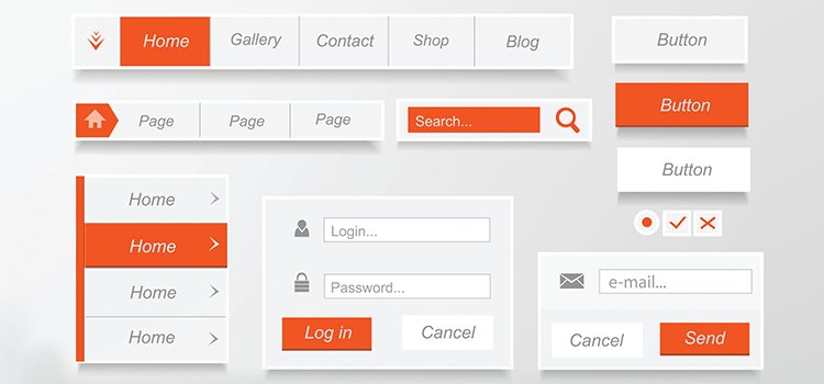
1. Complicated Navigation
Poor navigation is one of the most common issues on bad websites. This can include hard to find or non-existent menus, unclear links, and too many clicks for visitors to find information.
To avoid this, don’t change things too much that is taken for granted. For example, visitors expect the menus to be at the top, whether be it in the middle, or in left or right corner. Contrast the menus with the background with an opposite color and adjust the size to make it bigger. Same with the links, usually visitors expect clickable elements to be blue. Make sure everything is easy to find by checking if a page could be reached within 2-3 clicks from any page.
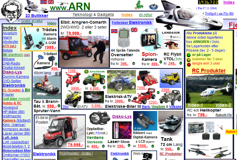
2. Bad Design
A website should look clean and professional. If it looks outdated, amateurish, or simply not visually appealing, it’s not going to make visitors stay. A good design is not only aesthetically pleasing, but also functional.
Don’t cramp your website with texts or images, but don’t leave too much whitespace either. You need to find the balance between the two. Don’t over- or underwhelm your visitors. Some design their website like an art piece, which is fine as long as it doesn’t ruin its functionality. For example, large high-res pictures and texts may look nice, however, if it obstructs other elements, such as the menus, then it is not a good design.
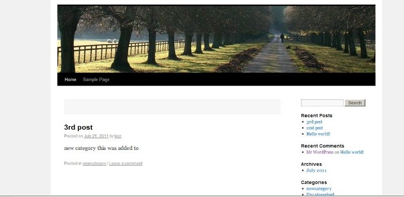
3. Poor Content
Content is key in any website. If the content is outdated or non-existent, visitors will not stay for long.
Your content should be high–quality, relevant, informative, and engaging. Use simple language, include pictures and videos, shorten the paragraphs, check grammar and spelling, and don’t stray away too far from the title. A reason why many websites have a blog section is to not only give the followers updates and useful tips, but also for the sake of creating more content.
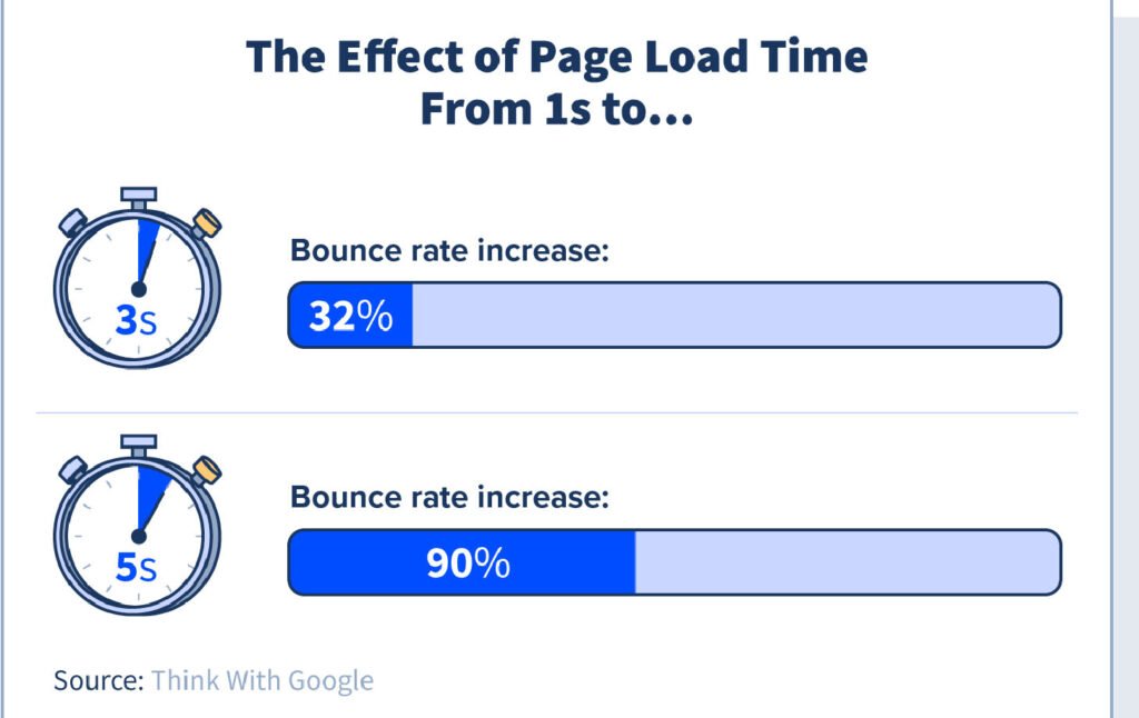
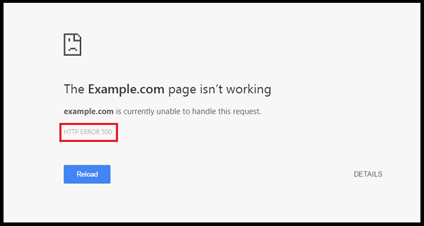
4. Slow Loading Speed
Slow loading speed is another major issue on bad websites. If a website takes too long to load, visitors will likely leave before they even get to see your content.
To fix this, you can optimize your website if you are using WordPress and use a good hosting provider. You can use more compressed .webp format images, smaller sized images and videos, and more simplistic design so not a lot of resources would need to be loaded. However, at the end of the day, your hosting provider and plan is what matters the most. You can use tools like Pingdom to check.
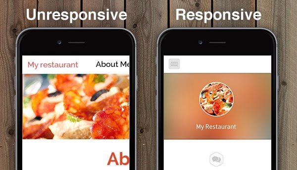
5. Unresponsive Design
Unresponsive design means that a website does not resize or adjust itself to fit different screen sizes or devices. Mobile phones are becoming increasingly more popular, and most people use their phones to browse the web. If your website is not mobile-friendly, it will be hard to use on a phone and visitors will likely leave.
You need to choose a responsive template and make sure your website looks good on all devices by visiting it on your phone and/or tablet. Most site builders already take this into consideration, however, it is still good to check the spacing and padding. If you are using WordPress, most of Elementor and Gutenberg themes are responsive. You can always preview the theme and template to see how it will look on different devices.
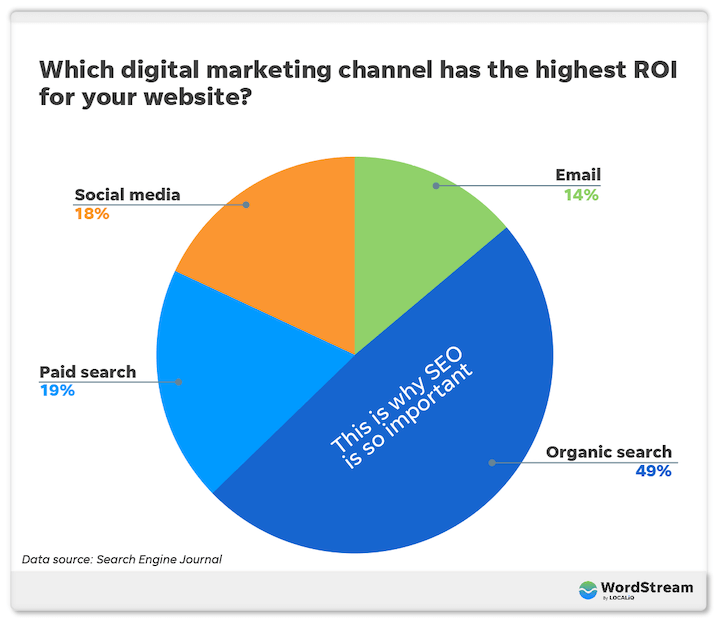
6. Lack of SEO
SEO, or search engine optimization, is the process of optimizing your website for search engines like Google. If your website is not optimized for SEO, it will not rank well in search engine results, which means fewer visitors. Most people will find you through search engines. If they search for you or your business and you are not on the first page, then it leaves a bad impression and many would move on.
If you are using a site builder, then look for “Advanced Settings/Options”, “SEO Settings” and/or “Optimization”. You will find “Meta title”, “Meta description” and “Meta tags”, or similar text fields. This is where you include your keyword in the title, description, and tags. For WordPress users, you can install “Yoast SEO”, “Rank Math”, or similar plugins. You will also find such fields in your pages and posts.
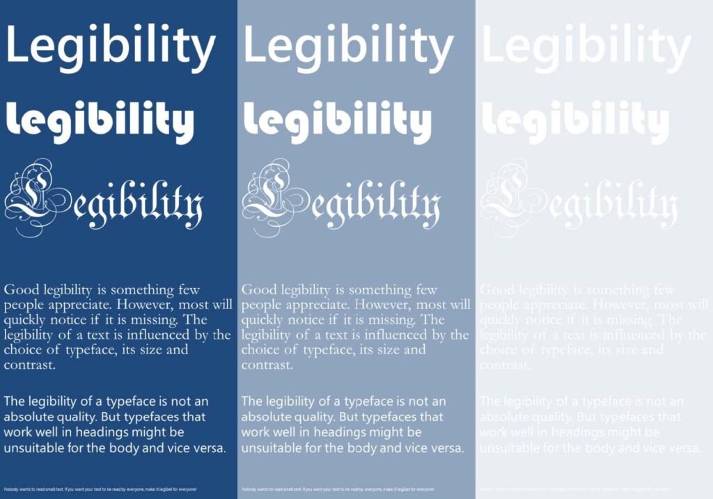
7. Poor Readability
Poor readability can make it difficult for users to read the content on your website. It could be that the text is too small or big, in a hard to read color, long paragraphs without any break, or uneven line breaks and such.
To avoid this, use a web-friendly font family, use a readable size between 11-18 (in the body text), choose a color contrasting the background, and avoid using too many different colors, fonts and sizes.

8. Unclear Call–To–Action
A call–to–action (CTA) is an instruction that tells the visitor what to do next. It can be a button, link, signup form, popup and more. If your CTA is unclear or confusing, visitors will not know what to do and will likely leave. You want them to explore your website.
Your CTA needs to be clear and concise. It should be obvious to the visitor which action they should take next. However, visitors don’t want CTAs shoved in their face every second. Place your CTA strategically throughout the page, for example, in the sidebar, above the footer, next to the menus, in the middle of the page, and such.
9. Not Up To Modern Standards
Security is important for any website. Websites should be built using the latest technology and coding standards. If your website is using outdated technology, it will be hard to maintain and will not look as good as it should, spammed, and hackers might gain access.
Make sure your website is secure by using SSL encryption, two-factor authentication, backups, and other necessary security measures. Use the latest standards when building your website, such as PHP 8.0 and above. Most hosting providers provide a certain level of security and for many that is enough. If you are using a site builder, they will take care of everything updates mostly happens in the background, but update anything else that requires manual action. For WordPress users, you can add “Wordfence” and such security plugins for an extra layer of protection.
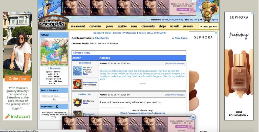
10. Too Many Ads
Ads can be a great way to make money from your website, but too many ads can be a turn–off for visitors. We know this might not apply to every site, however, the principle stays the same. You need to place your ads or CTA appropriately, so it doesn’t take the focus away from the main content.
Limit the number of ads or CTA and make sure they’re not intrusive. Try by opening a page and see where your eyes land first, it should be on the content. Decide what kind of ad format suits your website the best. Is it popups, header banners, fixed ads and such? Place your ads somewhere better, for example in the sidebar or inside the text as a break.


